
01707 880870
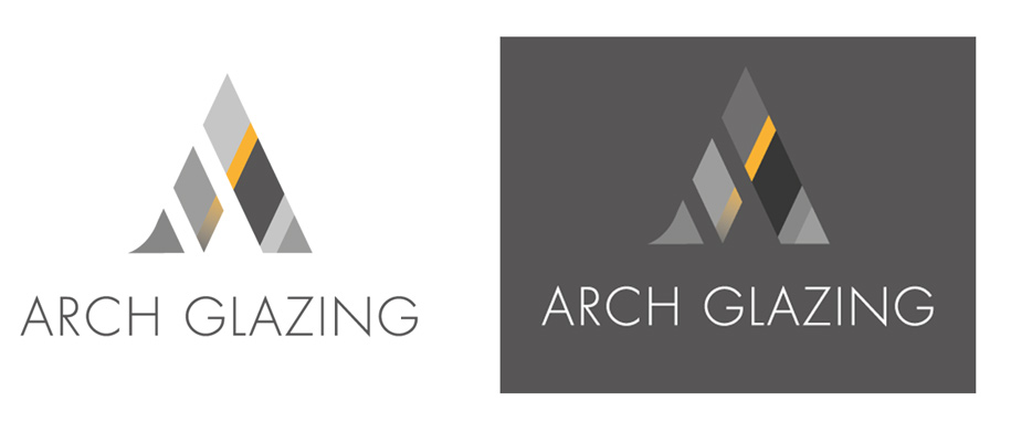
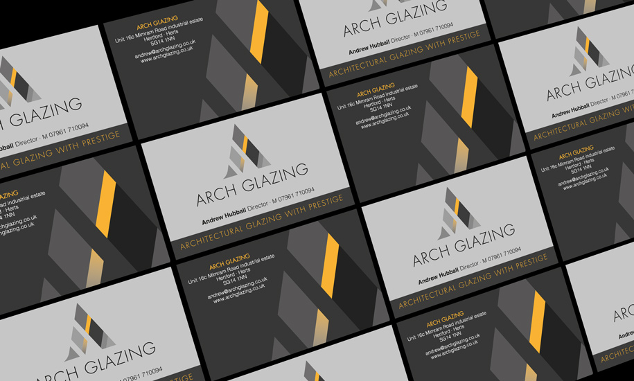
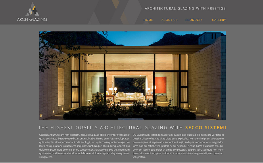
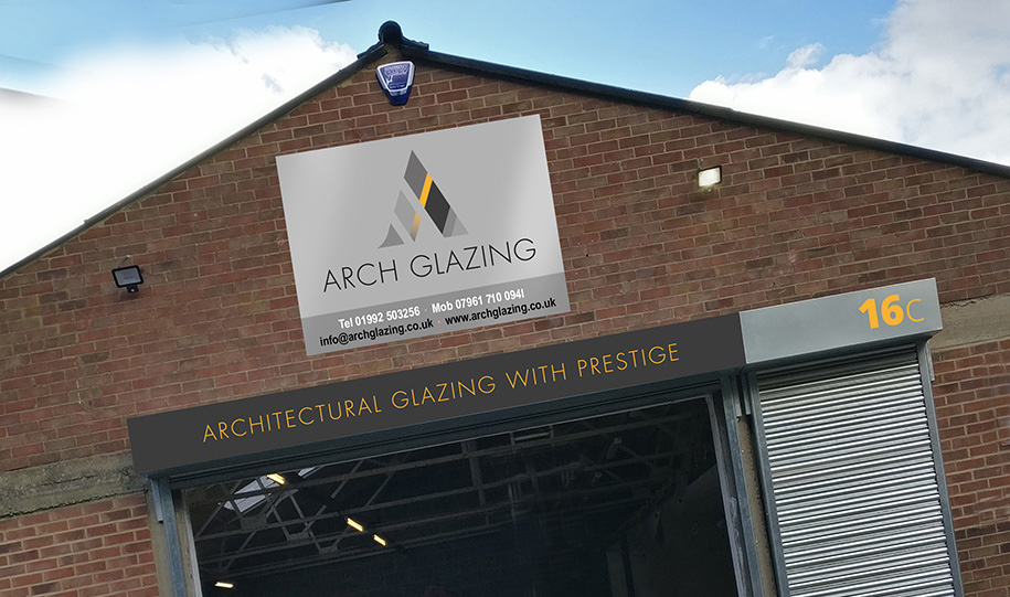
Start-up architectural glazing company Arch came to Red Echo for discerning new Identity that truly reflected their offer and target audience. CEO Andy Habball has a wealth of experience in high end architectural glazing so providing an accurate brand Identity brief was easy. The Identity is being rolled out anto stationery, website, vans, Premises and all touchpoints.
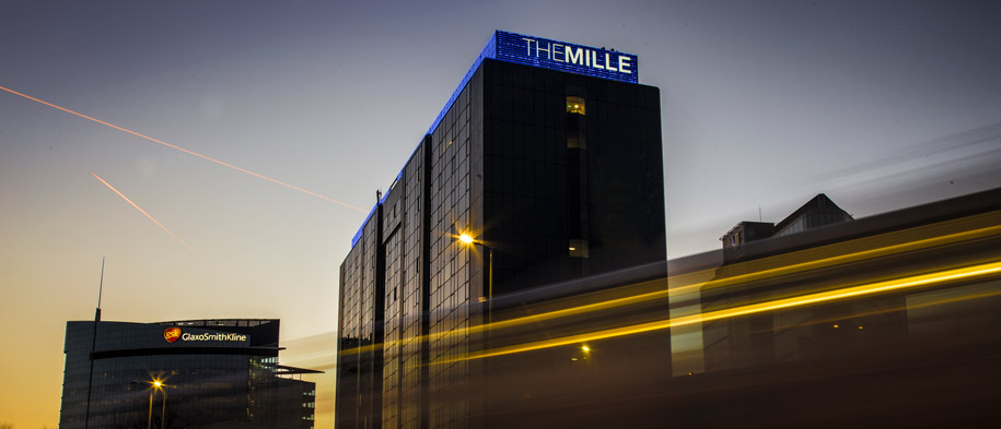
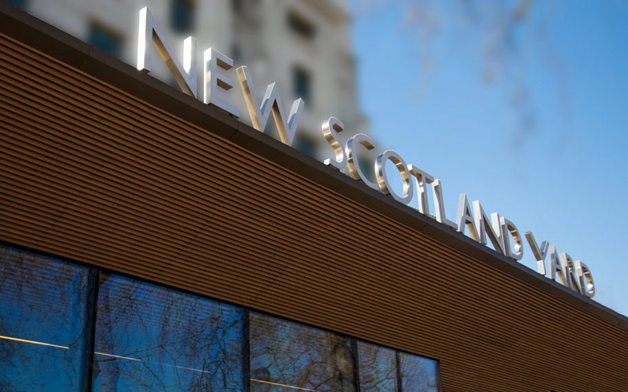
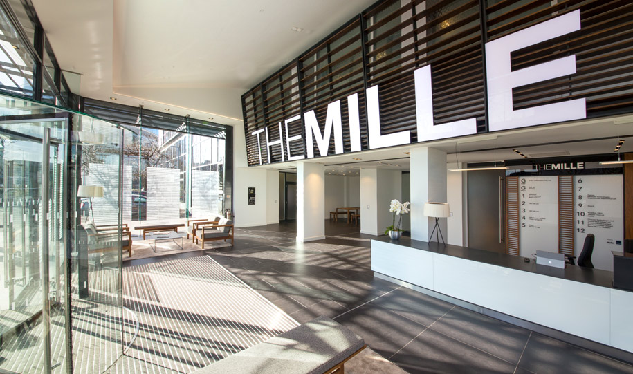
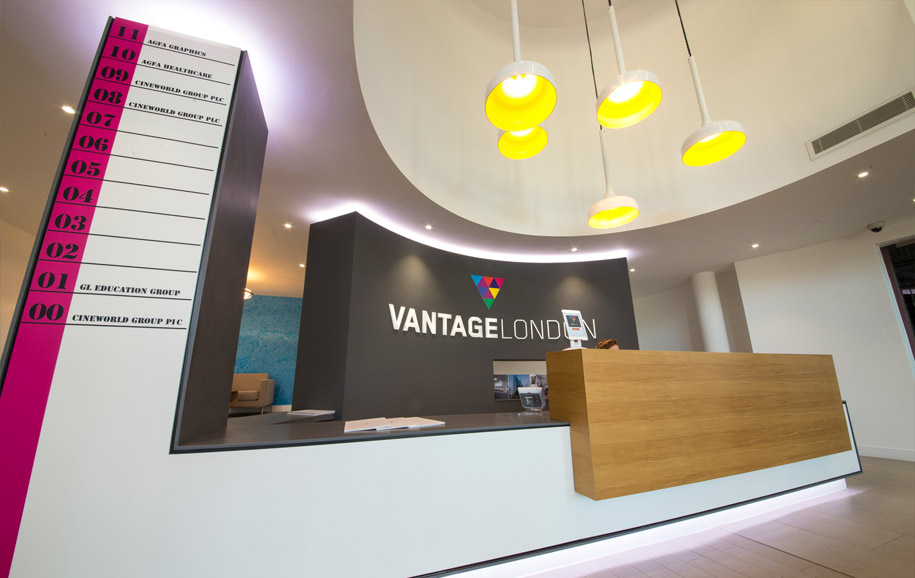
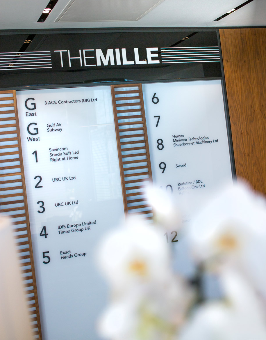
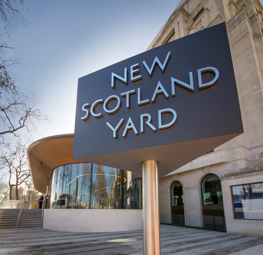
New Scotland Yard, The Mille-Westway, and Vantage-Westway have recently looked to Signbox for state of the art interior and exterior signage programmes. As custodians of the Signbox brand image, Red Echo were commissioned to take a series of architectural shots to enable them to keep their marketing collateral up to date.
The sites in the west end and west London needed to be photographed both in daylight and at night in order to portray the effectiveness of the LED light illumination of the signage. The traffic light trails were a welcome prop on some of the shots.
Signbox recently won Interior Project of the year at the British Sign Awards. We also updated their website personnel and work environment photography.
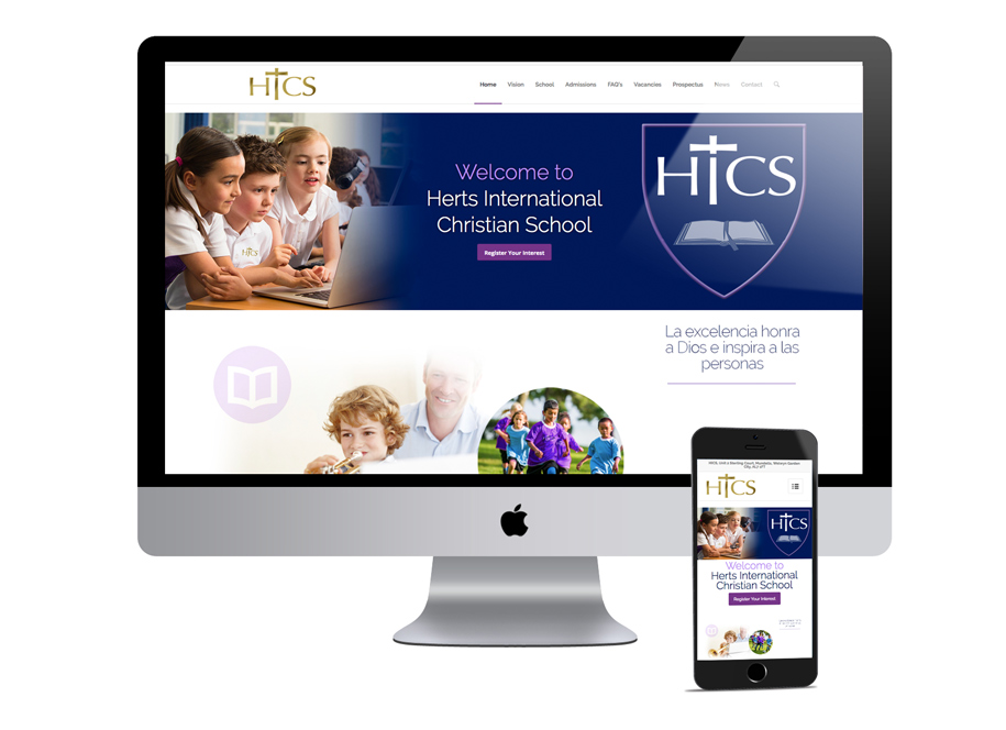
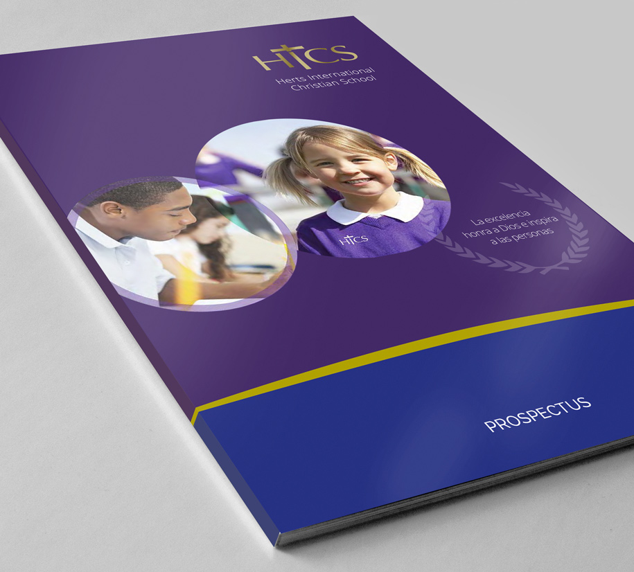
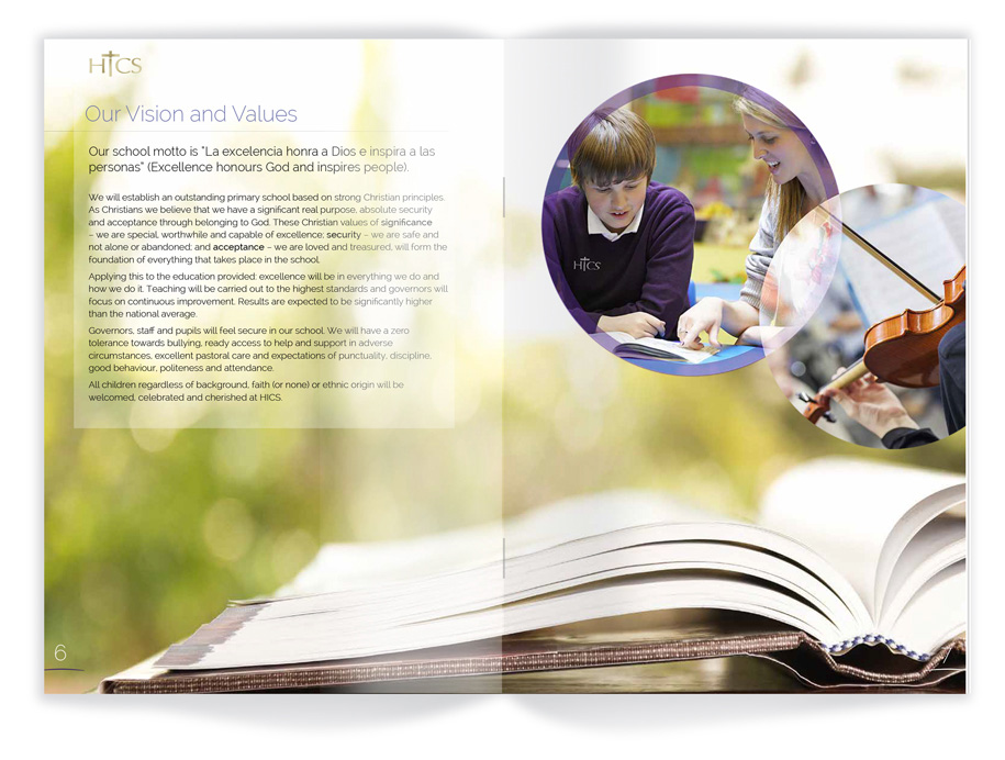
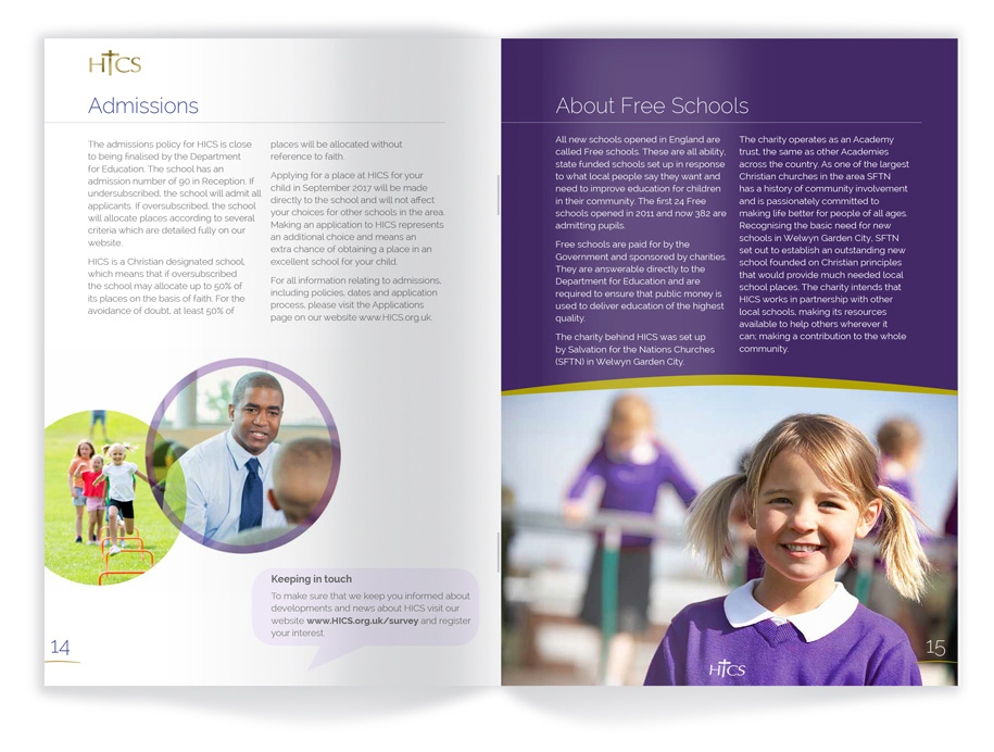
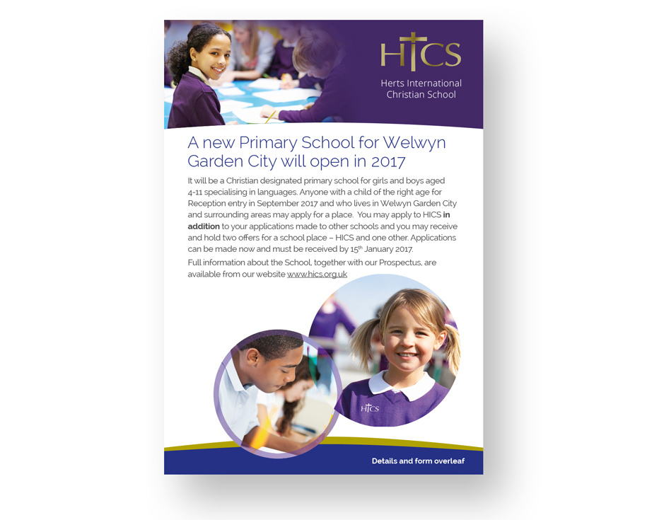
With plans to open a new primary school with a language specialisation in 2017, Red Echo Design won the tender to create a brand identity with which to begin an awareness campaign locally, that could be developed for the school opening and beyond. The existing logo was developed, a web site reskinned before embarking on the design of the school prospectus, flyers, school uniforms and email campaign graphics.
![]()
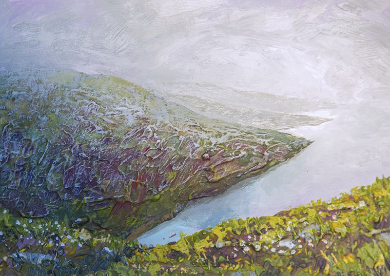
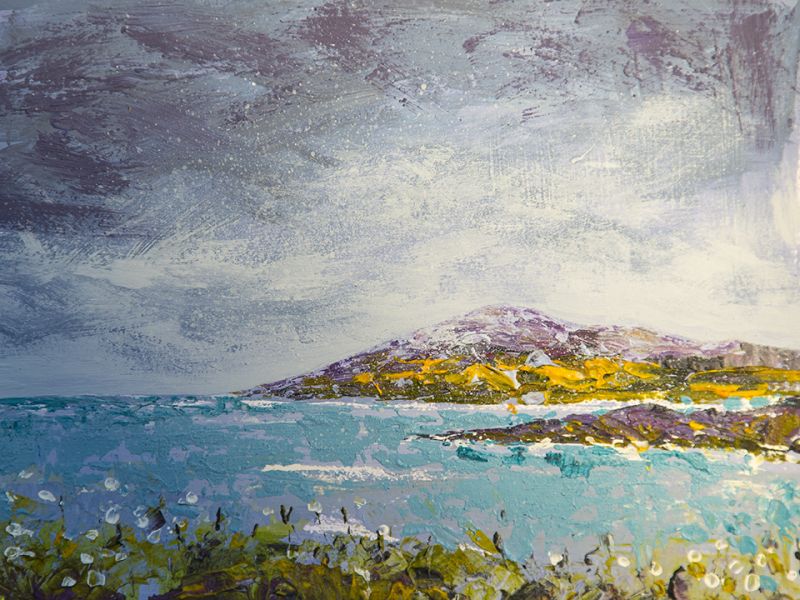
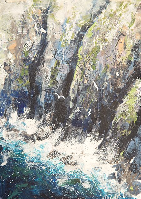
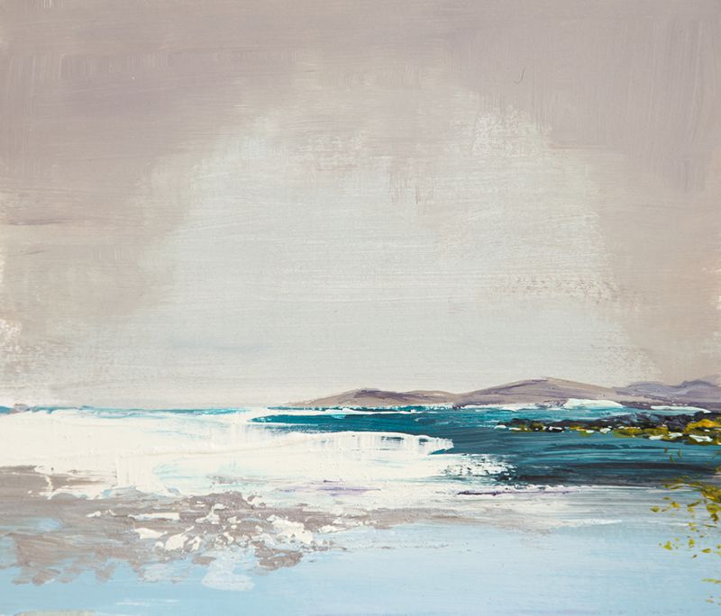
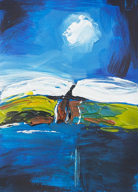
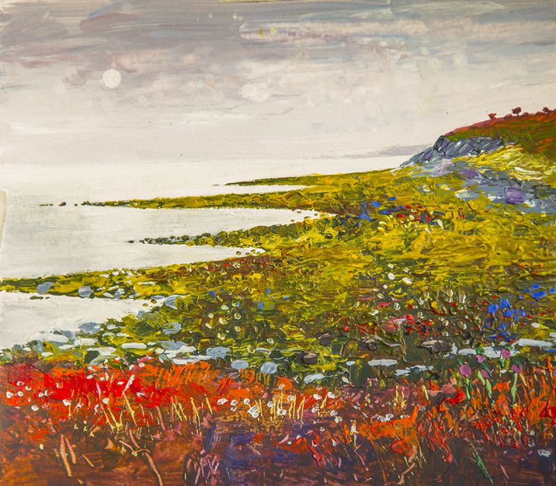
Abstract inspired by the Isle of Lewis
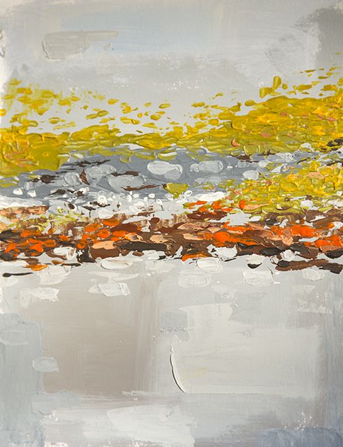
Two weeks of ploughing through graphic projects (...er, work) since holidays, finally on here to post a handful of sketches and paintings tickled out on my 2 week break up on the Isle of Harris and Lewis. All on A4, some abstracted, some just what was in front of me.
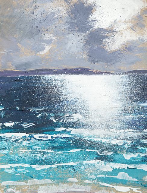
Since then I've been a busy wee laddie firing into some large and very large oils and acrylics with a distinct Harris influence. Mainly painted in the back garden studio ( that will be on a wallpapering table under a tarpaulin) Arriving on here very soon.......
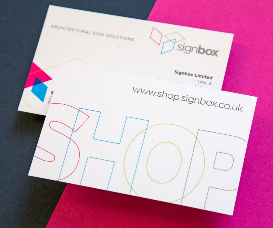
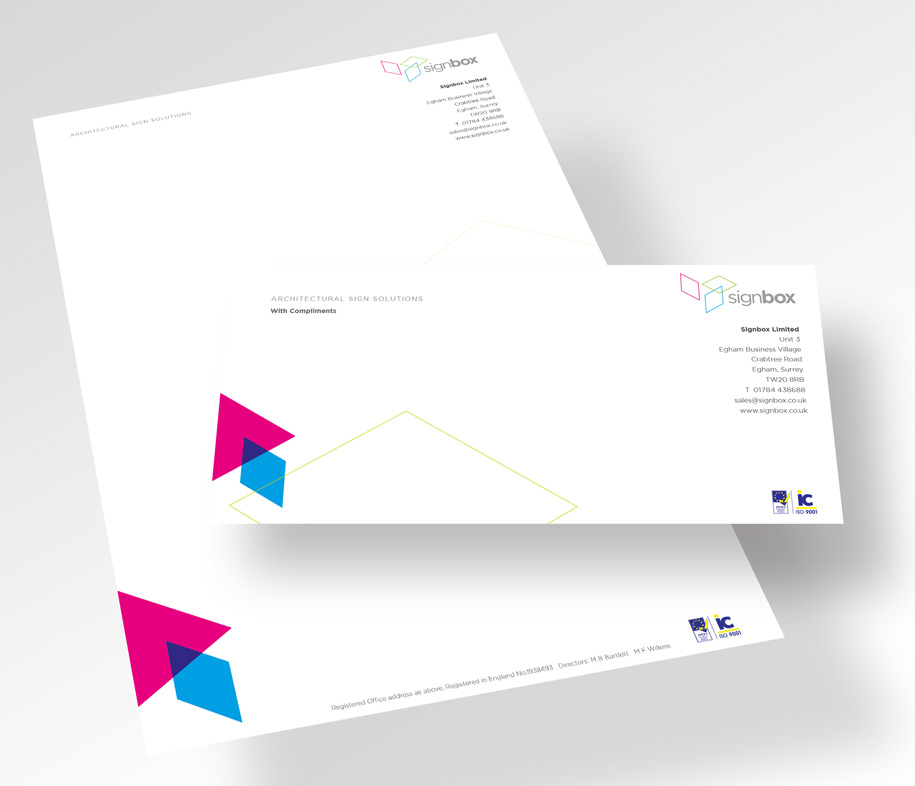
Time to roll out the new logo and identity onto all stationery items.......
Opportunity also to advertise the relaunch of the Signbox shopsite www.shop.signbox.co.uk
The logo for the Tokyo Olympisc in 2020 has finally been decided upon.
The original logo proposal was deemed to have been 'derioved from an existing logo design by Kenjiro Sanoso was shelved just five weeks after its reveal. Oops, Those designers!
As a consequence the organisers held a public competition that allowed anyone to apply and a shortlist of 4 were selected. The creators of the new shortlisted designs have submitted “written pledges” to the selection committee, stating that their work is original, and have also provided documents demonstrating the design process used to make them.
The wining solution was designed by Asao Tokolo of Tokyo, with a design based around chequers.
The official Olympics 2020 website explains:
“In Japan, the chequered pattern became formally known as “ichimatsu moyo” in the Edo period (1603-1867), and this chequered design in the traditional Japanese colour of indigo blue expresses a refined elegance and sophistication that exemplifies Japan.
Composed of three varieties of rectangular shapes, the design represents different countries, cultures and ways of thinking. It incorporates the message of “unity in diversity”. It also expresses that the Olympic and Paralympic Games seek to promote diversity as a platform to connect the world.”
The designer of the winning entry will receive a cash prize of JPY 1,000,000 (£5,500) and tickets to the opening ceremonies of the Olympic and Paralympic Games. Happy days for Asao Tokolo
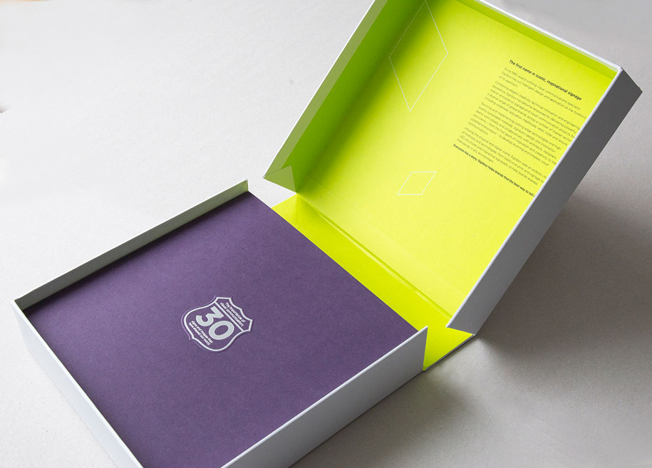
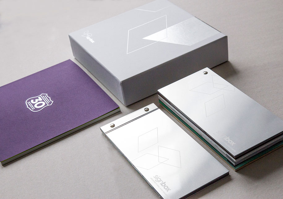
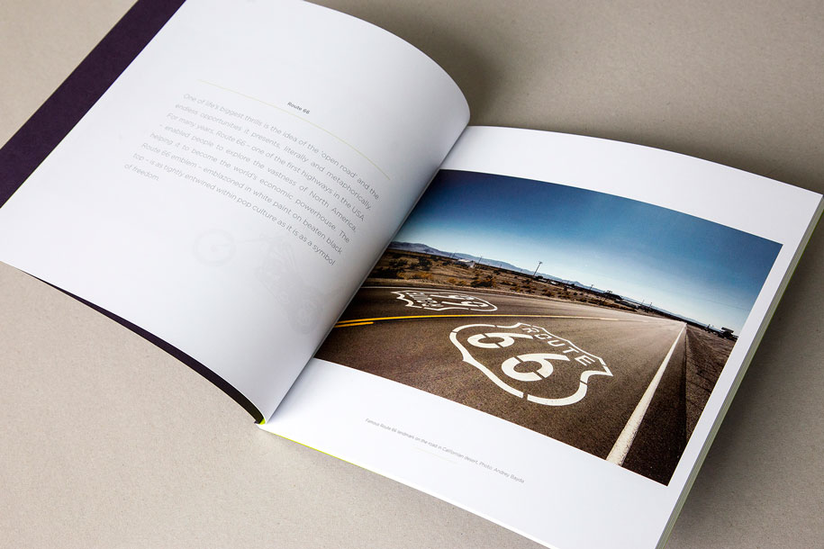
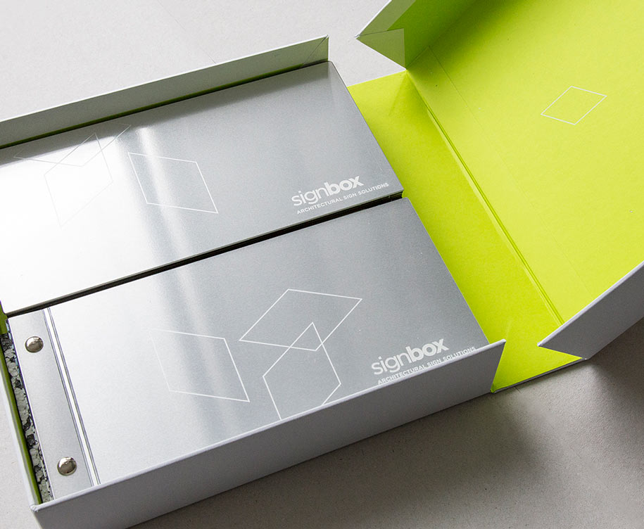
To celebrate their 30thanniversary, Signbox wanted to do something that truly conveyed why they do what they do, while simultaneously giving something back to their customers. Signbox invited their customers to submit their favourite image or sign so we could collate a landmark book. The result is 30 images and signs – one for every year Signbox has been in existence –that have helped shape the world.
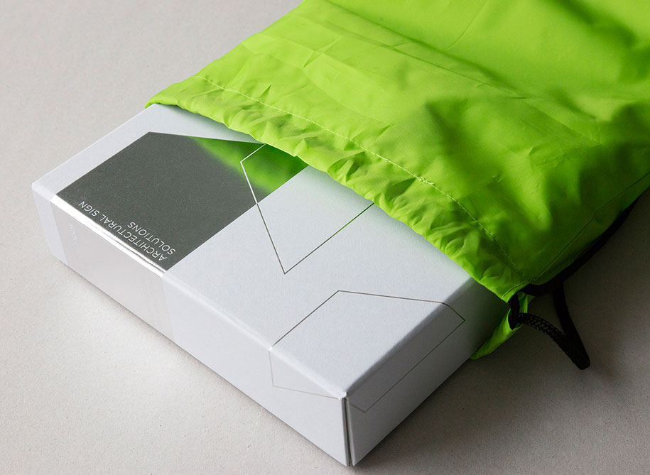
Red Echo was given the envious task of creating the book bringing into play a wealth of paper and metal textures, colours, print techniques aswell as cardboard engineering.
To encase the book Red echo also created a ‘Clamshell’ box to keep the book safe and give it a ‘treasured’ appeal. Nesting underneath the book snuggly were beautiful printed samples of the, graphics and imagery to showcase the capabilities and extensive finishes that Signbox had at their fingertips.
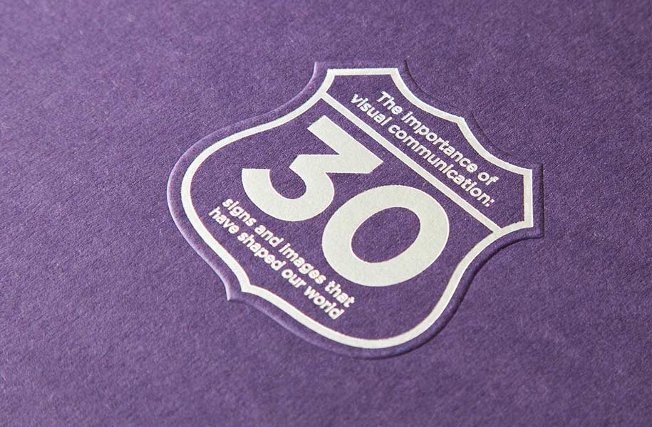
We have helped Signbox mark 30 years of creating beautiful signage in various sectors with an evolved simplified and sophisticated Logo and Identity together with an extremely keepable book and sample pack.
This evolved identity is being rolled out onto various touchpoints including stationery, building illuminated signage, website and vehicle livery. It was deemed that the outgoing logo had represented Signbox well for nearly four years, but the evolved ‘finer’ solution represents Signbox presently and into the future.
![]()
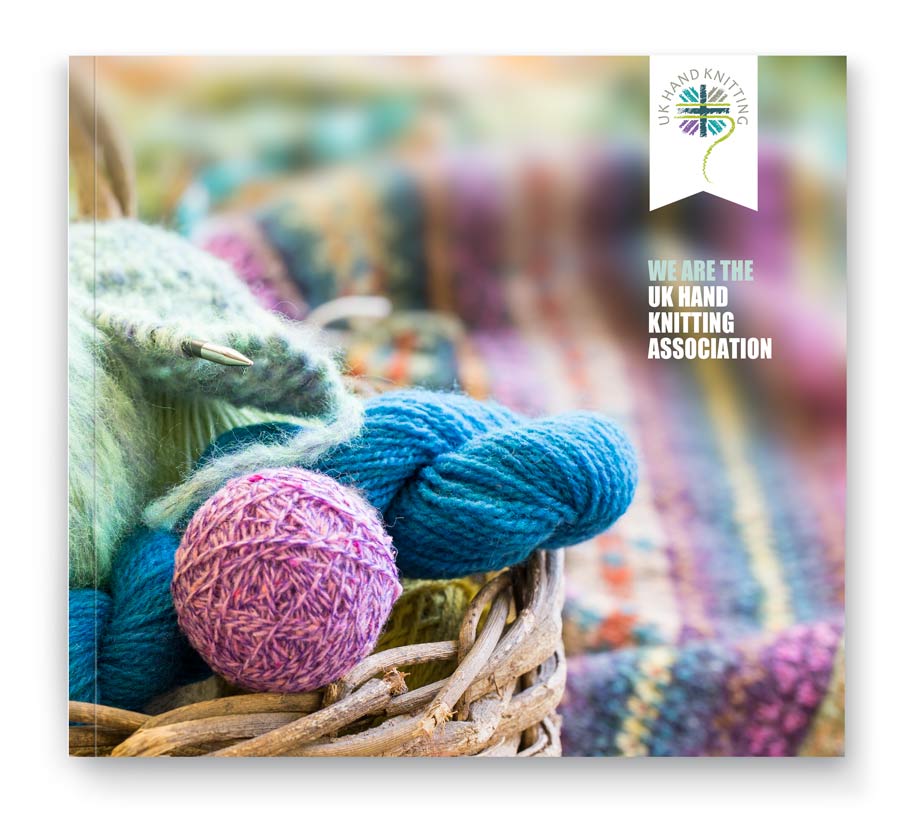
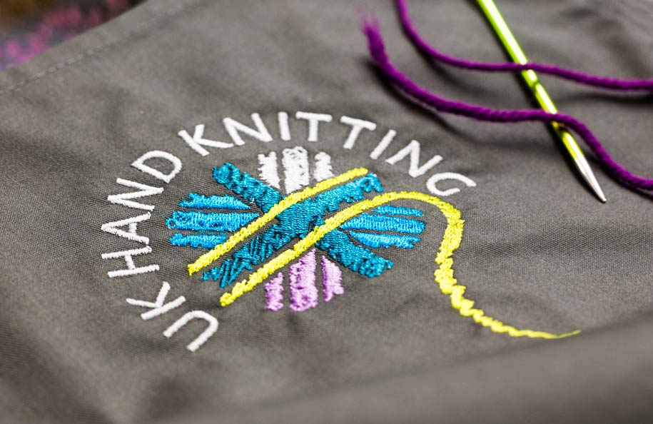
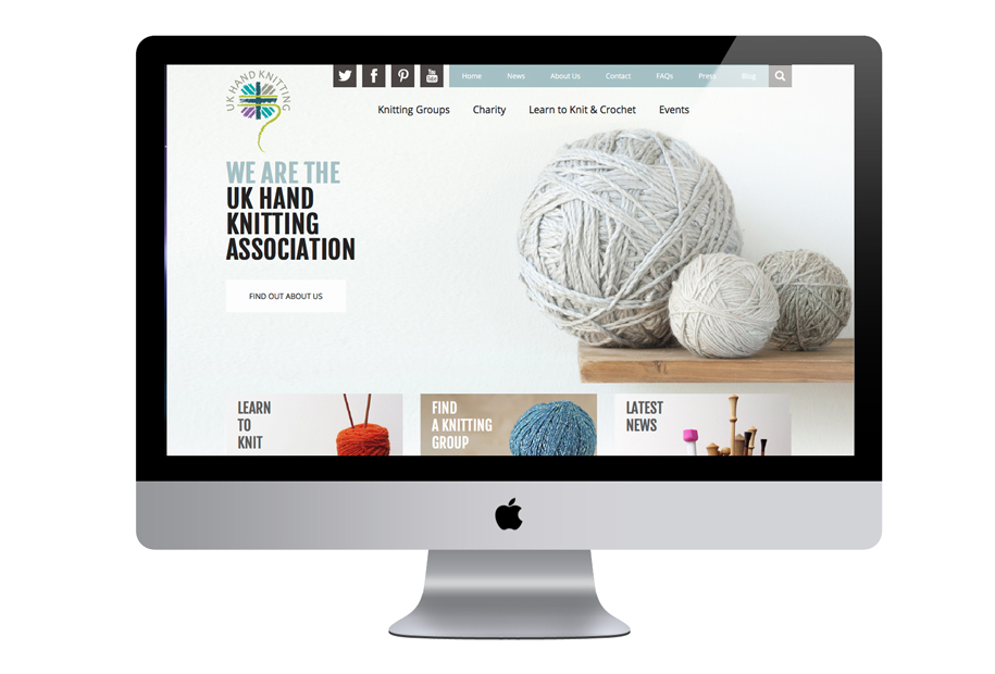
The UK Hand Knitting Association (UKHKA) is a not-for-profit organisation dedicated to promoting hand knitting and associated yarn crafts. They have developed a nationwide network of volunteers who pass on their skills to encourage newcomers to learn to knit or crochet at craft shows and other events across the UK.
Together with Bluebear, Red Echo devised a new logo which depicted The UKHKA as a contemporary and active Association with it’s roots firmly in the UK. The introduction of modern complementary colours and a suggestion of the Union Jack design helped create a distinctive image. The feel of the identity was then introduced to the UKHKA website by Bluebear.
![]()
©2026 Red Echo Design Ltd
